Understanding Colour as Frequency
Discover the intelligence in light: Kolorlan colours are carefully selected frequencies of light that communicate with your body's subtle energy field to gently rewire emotional and energetic patterns, supporting deep and lasting transformation.
Colour is a frequency of light...but why should you care about that fact?
Have you ever thought about how you respond to colour...? You see, colour as a frequency of light, carries information that our biofield automatically reads and responds to. Let me give you some examples...
- I once worked with an interior designer who refused to recommend red to his clients because that colour made him feel angry!
- Perhaps you have noticed that the colours you choose to wear can change your mood?
- Or how about the colours in your home: did you know that decorating your bedroom in pale pastels can enhance the quality of your sleep?
Intuitively, you already know that colours hold the power to change our emotional state and felt experience. You've probably just never thought about how this happens or what you can do to harness it to consciously create more harmony, balance, joy, even better health.
The Kolorlan System is here to guide you in that process. You don't have to understand all the details - your body will instinctively know what it needs. So, you are welcome to head straight to the shop and choose whatever is calling you today. Or you can continue reading this page and discover exactly how colour - the frequency of light - can empower you!

A customer experience
"I have always been fascinated with color...When Katie Dean released her Kolorlan system, I thought I couldn’t possibly learn anything new. I was so wrong. I have found that colouring with the system can either invigorate me, relax me, or inspire my creative juices. I’ve used it in the morning to encourage me, throughout the day to inspire me, and at night to relax me. I know I still have much more to explore, and I look forward to learning and growing more through this system."
Linda Beth
Harnessing what our ancestors always understood...
The Ancient Egyptians understood the power of colour and used it as a healing tool. The Rosicrucian philosopher and thinker, Rudolf Steiner, also recognised this and spent a great deal of time researching and understanding colours, developing principles initially explored by the artist, Goethe. Today, among many emerging energy healing practices, we have Chromotherapy - Colour Therapy - in which colour is deliberately and consciously used to support physical, mental and emotional healing.
That probably sounds nonsensical until you understand that colour is a frequency of light. All frequencies carry information. We are energy beings, naturally designed to communicate and respond through the medium of frequency. Once we understand this, we can use it to our advantage, to create deep, lasting transformation in our physical, mental and emotional health.
If you are already familiar with the ideas of frequency and resonance and how they carry information that we process through the biofield, then keep reading this page to discover the specific power of the frequency of light (colour) in the Kolorlan System.
If you're not sure what I mean by frequency, resonance, information or biofield, and why those ideas are important, I invite you to click on the button below and visit that page before returning here to explore colour.
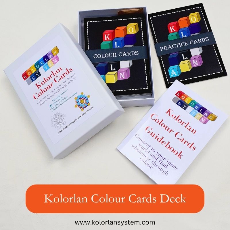
Kolorlan Colour Card Deck and Gel Pens
Gel Pens for the Kolorlan System

Kolorlan Colours
Get your Kolorlan colouring supplies for creating stunning wall art and greetings...

Do you really need more coloured pens?
If you have been exploring the Kolorlan System, you will have noticed that it includes its own set of branded gel pens. And, you may also be asking a question, "So, Katie, I already have loads of coloured pens and pencils. Why are you asking me to get another set here?"
That is an excellent and very valid question. The short answer is: these colours are not random. Remember, colours are frequencies of light, and frequencies carry specific information. I was guided to create the colours, and they are each carefully calculated.
If you wish to know more, read on..
Creating & Understanding Colour Meanings
It came as somewhat of a suprise to me, when I was developing the Kolorlan System, to learn that I would be creating my own set of colour cards and matching gel pens. If you would like to hear that story, you can discover more at the link below. If you are still interested in understanding colour meanings, keep reading this page.
How did I create the colours?
The short answer is: by using numbers. You see, the way in which we create colour in paint or as an effect on a screen uses a couple of different options...
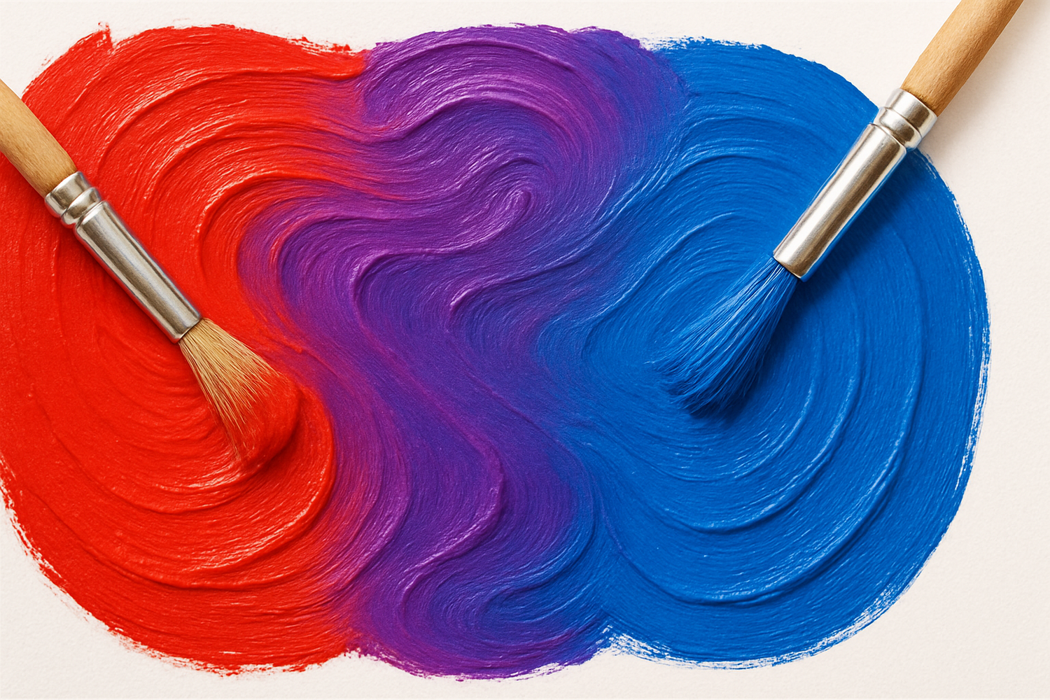
Option 1:
We can mix different quantities of the base colours, red, green and blue. We assign numbers to define the quantity of each base colour, and the combination will result in a specific colour and shade.
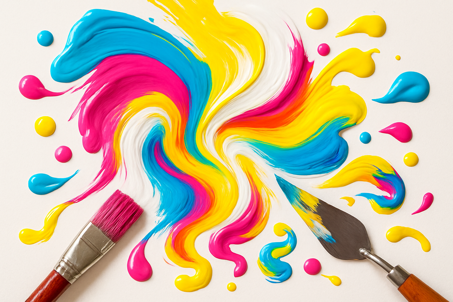
Option 2:
We can also use the CMYK route to achieve similar results. In this case, we are mixing specific quantities of Cyan, Magenta and Yellow, then adding a Key (black or white) to vary the shade. Again, we specifiy the quantity using numbers.
The significance of numbers...
Why are numbers significant? Because they are the building blocks of this Universe.
Geometry - the other portion of the Kolorlan System - is also created with number. And when you move into esoteric practices, number has been studied through Numerology.
It may not surprise you to learn that the roots of Numerology are also ancient. The understanding we have today can be traced back to Pythagoras, and it seems that his own studies included at least some - if not all - practices from Ancient Egypt.
So, it seems that our ancient ancestors may have had greater knowledge of the natural world and workings of the Universe, than we have today. Their knowledge is currently being "re-membered" in many new modalities.
So, the colour shades within the Kolorlan System are built on a personal understanding of numerology as a way to create a specific frequency of light.
Meanings of colours in the Kolorlan System
Remember how we were talking about frequency being a means of conveying more complex information? Well, each colour, as its specific frequency of light, is a doorway to exploring a whole field of information. In other words, a range of concepts and ideas that we can use and apply to understand more about ourselves.
When you purchase the Kolorlan Colour Card Deck, or the complete Kolorlan System, you will receive a guide book that details the meanings of each colour. If this is intriguing to you, then the section below gives you a brief outline for the main fifteen colours.
Colour meanings
Click on the colour name to reveal its meaning
Red
Red is the colour of your first Chakra – the Root Chakra. It signifies:
- Safety and security
- Grounding – the foundations or roots of connection
- Stability
- Boundaries
- Leadership and confidence
We associate red with the emotions of anger, power, ambition, confidence, energy. It also symbolises danger, warnings and stop. These symbols are all linked to the ideas of safety and boundaries. So, anger, as an emotion, is the body’s way of letting us know that our boundaries have been compromised and we need to take some action to repair them in order to keep ourselves safe. Receiving red will balance all these energies and help them to manifest in their most positive forms.
When it comes to physical healing, red fortifies the adrenal glands and is good for energy or combating fatigue. It also signifies sexual energy or potency. Red is a colour of warmth and can lift your mood.
Orange
Orange is the colour of your second Chakra – your Sacral Chakra. It is associated with:
- Emotions and their ability to flow freely
- Creativity
- Sensuality or sexuality
- The ability to determine your needs and desires
We associate orange with the emotions of celebration, abundance, enjoyment, freedom, self-expression. It can also offer a warning or a caution. So, orange offers us the chance to find balance. When we understand who we are, then we can use our creativity and freedom to express that.
On a physical level, orange activates the lungs and thyroid gland. It reduces cramping, strengthens the stomach and stimulates the building of new tissue. It supports the mind in problem-solving and finding new possibilities.
Yellow
Yellow is the colour of your third Chakra – the Solar Plexus Chakra. It is associated with:
- Empowerment: this is the ability to express yourself and defend your needs, without overpowering or subduing other people
- Self-esteem
- Confidence
- Willpower
- Authenticity
We associate yellow with the emotion of joy: it is a natural anti-depressant. It also relates to confidence, clarity and knowledge. So, yellow brings the capacity to share your authentic self, bringing joy to both you and others, feeling clear in who you are and confident in defending yourself or defining your needs, without needing to bully or undermine those around you.
Physically, yellow strengthens the nervous system and the mind. It stimulates the lymph and digestion and cleanses the liver and intestines.
Green
Green is associated with your fourth Chakra – the Heart Chakra. It is associated with:
- Love
- Compassion
- Open-ness and connection
- Empathy
- Forgiveness
We associate green with the symbols for “yes” and “go” and “all clear”. We also link it with nature, fellowship and community. It is an emotionally balancing colour, supporting hope, peace, harmony and rejuvenation. However, we can also associate green with greed and envy. So, this speaks to the need to create balance between self and others. When we are experiencing envy towards others, it may indicate a lack of care, compassion and love for ourselves. We seek to feel better by punishing those around us if we think they possess what we lack.
Physically, green aids the respiratory system and stimulates the brain and digestive system. Green is a neutral, calming colour that harmonises and soothes the body. It encourages the growth hormone and cleans and purifies.
Blue
Blue is the colour of your fifth Chakra – the Throat Chakra. It is associated with:
- Communication
- Authenticity
- Self-empowerment
- Creativity – it links closely to the Sacral Chakra
- Truth and purpose
The emotions associated with blue include calmness, faithfulness, loyalty and tranquillity. Some consider blue to be a cold colour. It is honest, sincere, believable, de-escalates situations and can facilitate open and calm discussion. So, blue is great for promoting balance, fairness and justice.
Physically, blue relieves itching and infections. It is cooling and can help to reduce fevers and inflammation. It also supports the thyroid.
Indigo
Indigo is the colour of your sixth Chakra – the Third Eye Chakra. It is associated with:
- Focus
- Psychic abilities
- Clear thinking
- Making decisions
- Wisdom
Emotionally, indigo is associated with empathy, transformation and acceptance of reality. This colour can help you to understand and accept your current situation, developing the faith that everything is as it should be. Finding the wisdom to know what you can change, and what you simply need to accept. It is freeing and purifying.
Physically, the colour can aid in healing eyes and ears, relieving tension headaches.
Violet
Violet is the colour of your seventh Chakra – the Crown Chakra. It is associated with:
- Meditation and spiritual enlightenment
- Psychic abilities
- Inspiration
- Divine guidance
- Connection with the Creative Source of the Universe (whatever name you use for that)
Emotions linked to violet are transformation and inspiration, connecting with your purpose and life force. So, violet can assist you in connecting to your dreams and gaining the insights you need to turn them into reality.
Physically, this colour promotes general healing and supports white blood cells and immunity.
Gold
Gold is the colour of your eighth Chakra – the Thymus Chakra. It is associated with:
- Godliness and higher levels of consciousness, a bridge between the physical and spiritual
- Unconditional love
- The will of the Soul
- Self-acceptance
- Abundance
The emotions associated with gold are altruism, forgiveness, empathy, love. Physically, this colour links to the thymus gland which produces the lymphocytes in your immune system. It is a combination of male and female energy and is related to the capacity for being touched and feeling things. Gold also relates to abundance, security and acceptance. When it is in balance, it helps you to feel conscious of your identity and acts as a channel of Divine love. When it falls out of balance, it can induce feelings of defensiveness, resentment that things have been taken from you, leading to a rejection of self-love, self-care and a tendency towards self-deprivation.
Silver
Silver is the colour of the ninth Chakra – the Thalamus Chakra. It is associated with:
- Self-knowledge
- Judgment and awareness
- Condemnation
- Psychic abilities and connection to the higher state of consciousness
- Clarity
- Strategy
- Unification and stability
The thalamus is located in the brain. It relates to self-knowledge, judgment and condemnation. It also brings clarity, strategy and the power to stabilise and unify. Physically, it stabilises and neutralises ailments and can support healing and repair. We use silver to solder and join elements. So, at its best, silver will bring awareness and the ability to create supportive, strategic solutions to problems. When out of balance, it can become overly judgmental and self-critical, feeding or creating thoughts of unworthiness.
Blue-Black
This colour corresponds to your tenth Chakra – Galactic 1 Chakra, which is the first of the three Chakras relating to the witness state. This colour is associated with:
- Connection to deeper consciousness
- Seeking deep truth and communication
- Darkness
- Astral travel
The witness state relates to accessing the part of yourself that can sit back and simply observe and allow the flow. It sees emotions come and go, but does not become them. It is able to remain calm and stable, whether life is flowing smoothly or becoming stormy and uncomfortable. Stepping into the darkness can feel scary, and it can also bring forth great riches. The blue-black element is about exploration and seeking the deeper truth. As you do this from a place of calmness and stability, you remain able to maintain your balance when the truths you discover seem challenging.
Silver-Black
Silver-black is the colour of the eleventh Chakra – Galactic 2 Chakra. It is the second of the three Chakras relating to the witness state. It is associated with:
- Exploring the darkness
- Alchemizing dark into light to find balance and stability
- Even deeper states of consciousness
- Psychic abilities
Silver-black is linked specifically to the idea of bringing in balance. Alchemising the darkness into light as you see the silver linings. Every challenge we face ultimately turns out to be a blessing, bringing us something of value. It may take time to appreciate and understand those blessings. But when we have the courage to step into or face the darkness, we can find the light within.
When we attempt to resist or deny the darkness, we remain at the mercy of whatever we wish to avoid or deny. Again, if we are able to explore from the stable state of witnessing and not becoming the challenges, we can learn the lessons and absorb them with minimal pain and suffering. Our attitude has a strong bearing on how much we suffer. The more we can seek understanding and move from a place of love, compassion and acceptance, the less we suffer.
White
White relates to the twelfth Chakra – Earth Star. This is the third Chakra located within the witness state. It is associated with:
- Divine light and higher consciousness becoming grounded in the earth
- Awakening and exorcising demons
- Cleanliness, purity, simplicity
- Balance
This Chakra and its related colour balance out the darkness of the other two colours in the witness state. Again, it is important to remember that the witness state is related to rising above and observing the ebb and flow. So, it may feel tempting to seek out the light and reject the dark. This would lead to an imbalance. Think about the silver-black state creating a balance between this state of light (white) and the opposing darkness. We are also a channel that links the spiritual and physical. So, the energies from the Galactic Chakras need to be grounded, or earthed within the Earth Star Chakra, which is located just below the feet, in the earth. That stabilises and grounds us so we are capable of witnessing.
Turquoise
This is related to the thirteenth Chakra – the Earth Core Chakra. It is the first of the three Chakras located in Universal Consciousness. Within this state, we are getting deep into the fundamental process of creation. This colour is related to:
- Divine masculine qualities
- Intuitively seeing the path ahead
- Awareness and caring for the good of all
- Harmonising and building a positive future
The emotions associated with turquoise include increased sensitivity and awareness of the needs of others. A desire to protect and serve in the highest and greatest good for all. Turquoise is linked to the divine masculine. This is the quality that facilitates building. We create an idea, and then have to build it to bring it into physical reality. So, this is strongly connected to the core of the earth – the core of our physical reality.
Divine masculine qualities are: strength, balance, certainty, stability, confidence, decision-making, problem-solving, managing, ambition, drive, structure, organization, single-minded, logic/mental analysis, focus, building things, linearity, efficiency, grounded, power, leadership, discipline, purpose/direction, excellence, competitiveness, assertiveness, autonomy/independence and freedom.
Pale-Yellow
This is the colour of the fourteenth Chakra – Universal 1. It is the second of the three Chakras located in the realm of Universal Consciousness. It is associated with:
- Balance of power – uniting the divine feminine and divine masculine in harmony
- Lightening and brightening the soul
- The empowerment of yellow, combined with the peace of white
The emotions related to this colour include those linked to yellow: brightness, empowerment, clarity, confidence, and those linked to white: purity, freshness, simplicity and balance. This Chakra unifies the divine feminine and divine masculine in order to create through flow. It is balancing and flows with ease, spreading light and love.
Pale-Magenta
This is the colour of the fifteenth Chakra – Universal 2. This is the third and highest Chakra in Universal Consciousness.
It is associated with:
- The divine feminine
- Life purpose and life path
- Magnetism to attract or repel other people or situations
- The root of all creation
This colour is linked to the emotions of selfless love. It is powerful and dynamic and also harmonises all other emotions. It supports the use of personal power to create your life’s desire from a place of unconditional love. Physically, magenta supports the circulation, reproductive organs, strengthens the kidneys and stimulates adrenalin and the heart.
This colour relates to the divine feminine, the creative energy that provides the impulse for all of life. The divine feminine qualities are: music, art, creativity, playfulness, non-linearity, accepting chaos, giving, self-caring/nurturing, receiving, flow, sensuality, compassion, intuition/psychic abilities, synchronicities (non-linearity), allowing, acceptance, empathy, relaxation, friendship, community, connection and romantic relationship.
Five Densities of Light
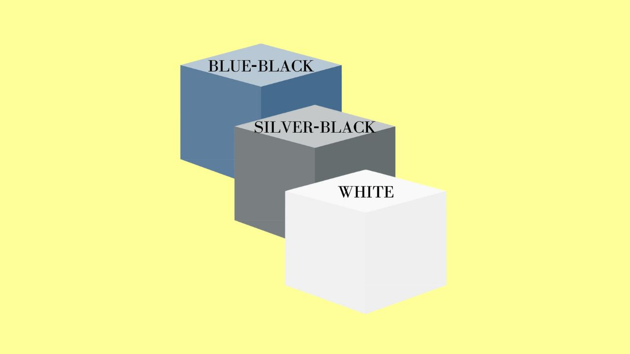
These fifteen basic colours are also arranged into five densities of light. So in density one - the lowest light, highest matter - we have red, orange and yellow. In density two, we have green, blue and indigo. Density three contains violet, gold and silver. As we move to density four, we meet blue-black, silver-black and white. Then, in density five - the highest density of light, closest to "Source" level - we have the colours of turquoise, pale-yellow and pale-magenta.
Now, each of these densities also has their own layers of meaning. We can equate them to brain states - the higher densities being the states we achieve in deep meditation or dream states. So, I will share just a couple of examples here.
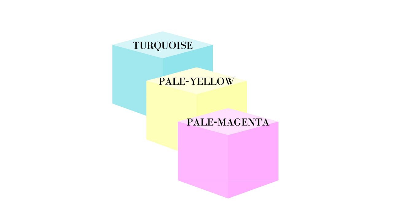
Density 5
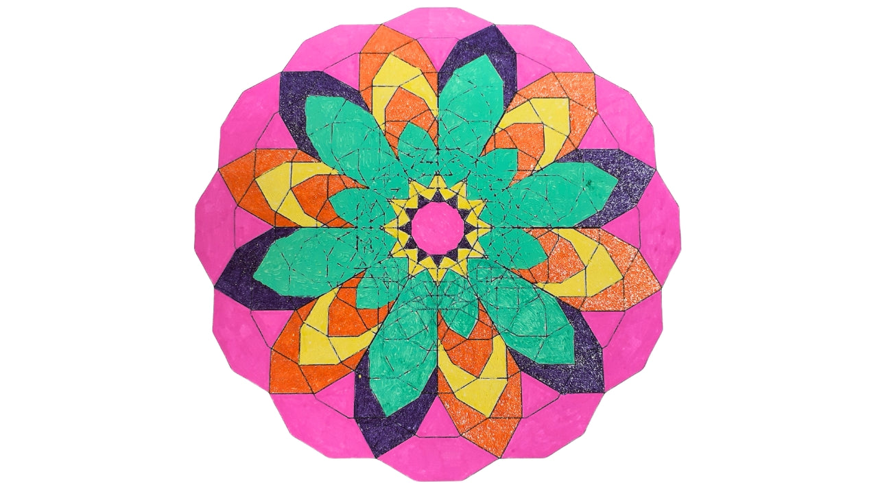
Density five is the level closest to the point of creation. Remember what I just shared about one of the methods for creating colour being the CMYK coding? Well, what are the colours in density five?... Turquoise (cyan?), Pale-Yellow (yellow?) and Pale-Magenta (magenta?). If you have just viewed the individual colour meanings, you will notice that these colours represent the divine masculine, divine feminine and union between the two...in other words, the seat of creation.
Density 4
As we move to density four, we have a brain-wave state that is closest to the "witness" state in meditation. The space where we can notice and observe our thoughts, emotions, physical pain even, but not become those things. We are aware of being in our space of higher self or True Self having a particular experience, moment by moment, through the physical body. And colour-wise, the colours of blue-black, silver-black and white speak to the idea of exploring the dark and light, or seeing the truth (blue element in blue-black) and transmuting darkness into light.
Using Frequencies of Light to Support Transformation
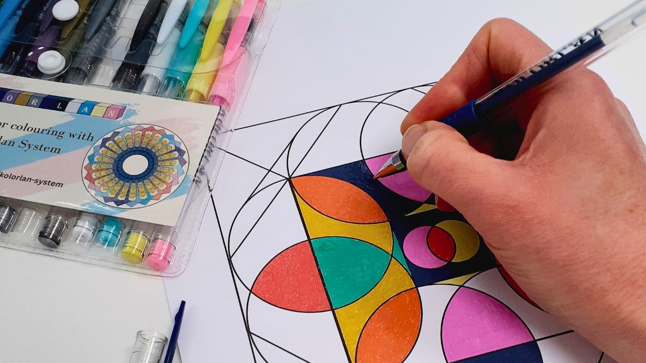
When I am colouring any of the geometric images, I do use the colours consciously, to some degree.
However, "conscious" is not the same thing as "calculated". For me, this is an intuitive process in which I sense which areas to accentuate in particular ways, through colour.
My understanding of the individual colours and the five densities will guide me to explore messaging within the design. For example, I might use the density four colours to create a "witness state" around another colour to support gentle processing of the emotional information held within that colour.
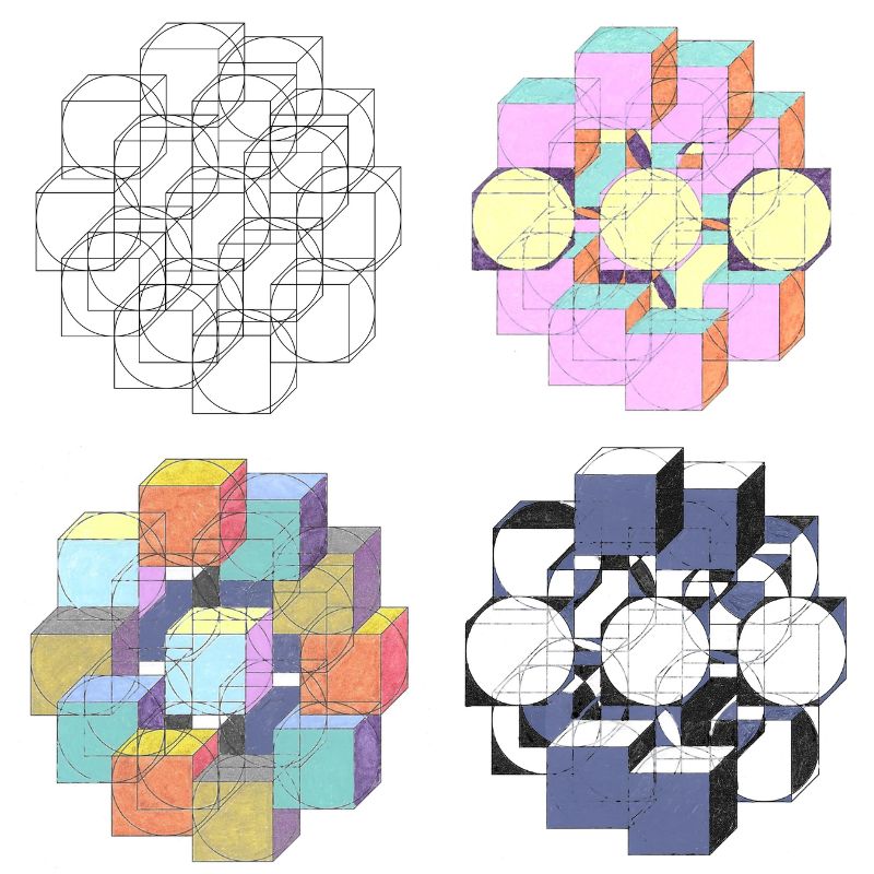
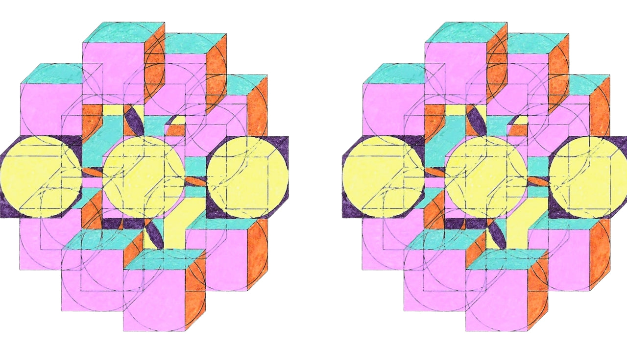
It is fascinating to discover that a single geometry, when applied with colours in a particular order, will carry specific information.
Then, applying different colours, or even using the same colours but in a different order, can change the information. This is literally creating a different frequency.
It feels almost like a musical composition where each colour or shape contributes its own note to the whole image. Our biofield is capable of absorbing and responding to all of this, yet our intellectual mind does not need to understand or interpret it.
If this idea intrigues you, the links below invite you to explore further and discover some of the actual information that different frequencies carry.
We also have the power to layer our own individual intention onto the way in which our biofield chooses to respond...or not.
Taking this back to the general discussion of frequency, it is possible for any individual to block receipt of any type of information from these images. While others, who may feel more drawn to this, or simply have a more open mind, find themselves receiving and responding to the frequency, and experiencing change in themselves.
Sometimes, it is good to remember that we do not need to consciously understand everything in order to benefit from it.
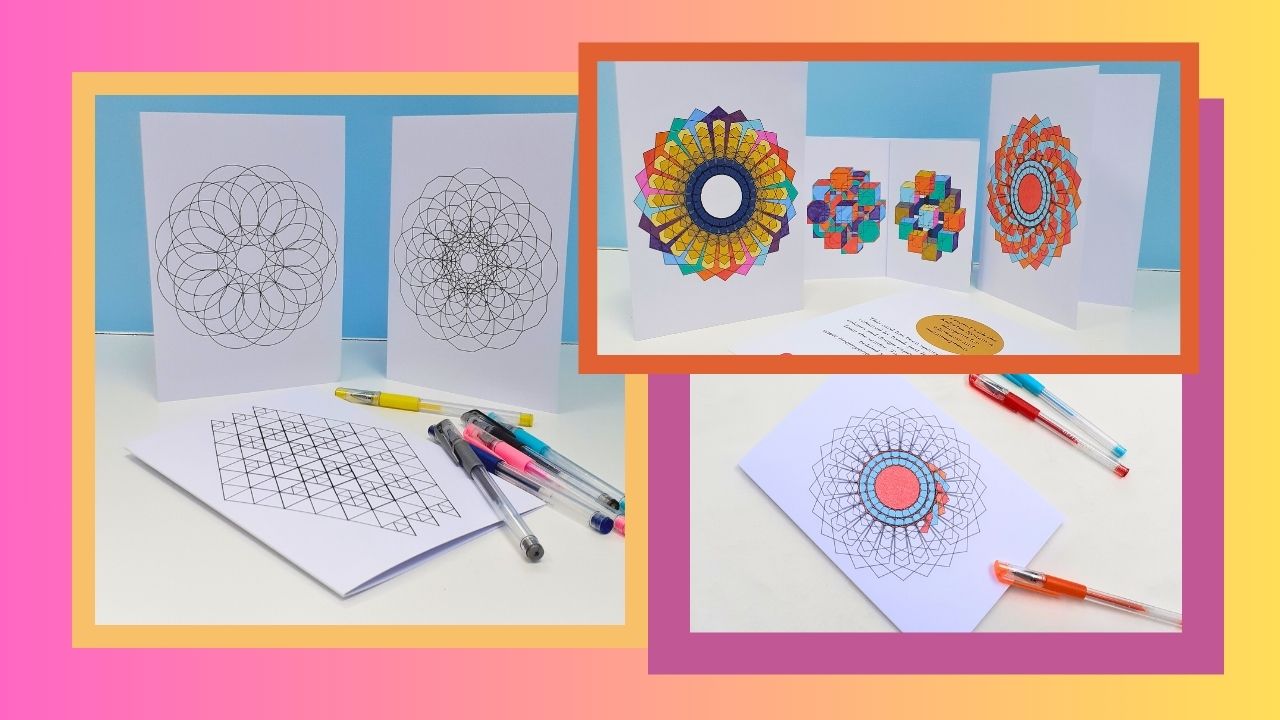
"It was so interesting and exciting, as though a calmness entered and relaxed both of us in our time together. There’s magic to the cards!" Lou

"This may sound odd (well, I know you won't find it odd!) but I sense a change in my feelings and interactions with others: I feel a greater acceptance, tolerance and understanding. Everything about your Kolorlan coaster feels just wonderful. Thank you so much, Katie." Jill C
"I found the colouring interesting, creative, calming and contemplative – on one level it's mindful and absorbing – on another level it has the capability to be a transcendent experience." Lynne S
Explore More Kolorlan Products
-

Kolorlan Coasters
These beautiful glass Kolorlan coasters are available as a finished gift, or...
-

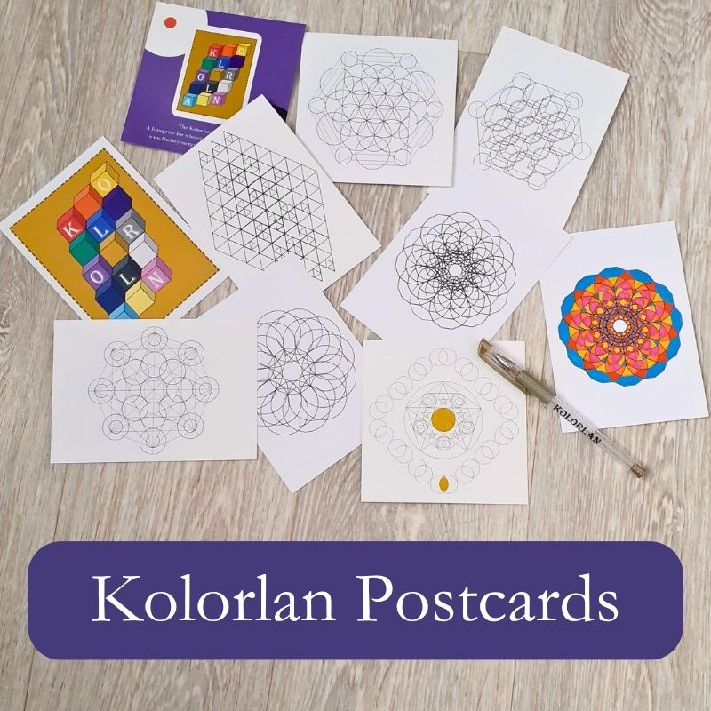
Kolorlan Postcards
Kolorlan postcards allow you to create stunning artwork and gifts. Use the...
-

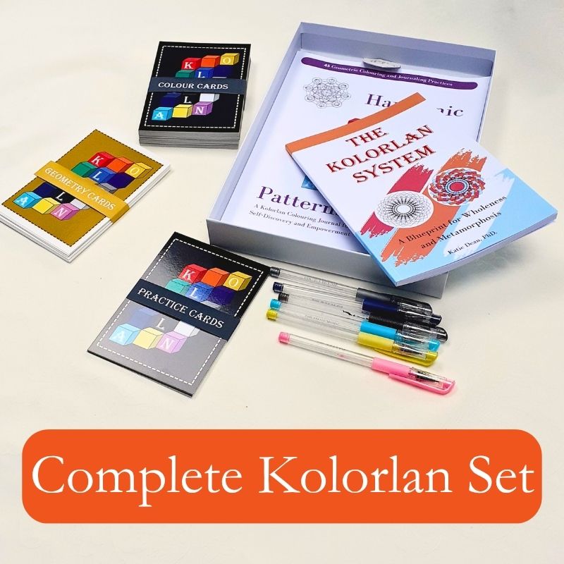
Complete Kolorlan System
The Kolorlan System is designed to help you explore your inner world...


